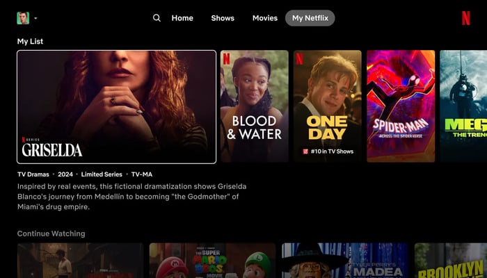
Netflix is revamping its TV app with a new look to simplify navigation and enhance the user experience. The redesigned homepage replaces static tiles with dynamic boxes that expand when selected, displaying trailers, descriptions, and essential information.
This redesign streamlines content discovery, eliminating the need for excessive scrolling. Previously, users had to navigate through multiple menus to find what they were looking for. The new design combines essential features, making it easier for users to find their next favourite show or movie.
Hovering over the title triggers a short preview, and additional information such as the synopsis, year of release, episodes, and genre is readily available.
Streamlined menu
The updated menu removes the left side menu, replacing it with a sleek top menu containing Search, Home, Shows, Movies, and My Netflix.
Read more: Uber planning to add games to its iPhone app
This change cleans up the interface, making it more intuitive. My Netflix, initially introduced on mobile devices, provides personalised recommendations and quick access to recently viewed or saved content.
The redesign marks an important step for Netflix, especially as the platform expands into new types of content like live events and sports.
The company will initially test the new homepage among a small group of users using smart TVs and streaming devices, with plans to roll it out to more users if successful.
Netflix's renewal demonstrates its commitment to innovation and customer satisfaction. With this new design, Netflix sets a new standard for streaming services, making it easier for users to find and enjoy their favourite content.


